Also check out below articles
 01-08-2025
ChatGPT shared conversations are visible to everyone
With the widespread adoption and use of AI in the workplace more and more08-05-2026Detect broken links
Prevent 404 errors from ruining your SEO score and user experience. Nothing13-06-2026Why Cloudflare Isn't Always the Best Choice
As a website owner you naturally want just one thing: a website that’s always06-08-2021Measuring the mobile performance of your website
To see exactly which device a user is using on your website you can take the following steps within Google Analytics and Microsoft Clarity. Mobile traffic can differ per website and you can optimize for it in the following way. A satisfied mobile user can be just as valuable as a user who comes to your website on a desktop. Purchases are made very often with Mobile devices, it doesn't matter if you have a webshop for goods or sell software. In recent years, these boundaries are also blurred by, for example, finding your website on a full desktop experience, and then buying it on a mobile device.
A website can be viewed on any device, as a webmaster you need to make your website suitable for every device a user can use. This is to ensure that you don't lose traffic for unnecessary reasons. A website that is not suitable for a certain device or screen size that is used by 5% of your users will lead to a monthly percentage that can make the difference. So take some time to measure your mobile performance in the following ways.
Mobile users in Google Analytics
To view your mobile users within Google Analytics, you can select them in the following way. You go to the target group within the left menu and then click on mobile. After this you can further select the device used to view this. And choose a secondary dimension to view a certain metric, like the bounce percentage or on which page they landed.
Mobile users in Microsoft Clarity
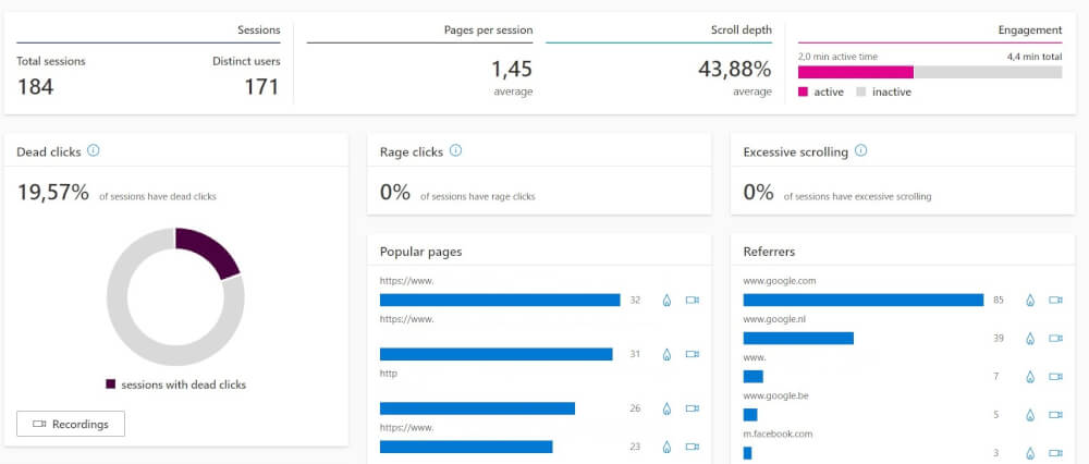
Mobile users in Microsoft Clarity can be viewed by performing the following steps. In Microsoft Clarity you can easily select the mobile users in the filtering at the top. After this you will have all the statistics you need on the page. As well as the sessions and heatmaps which can be viewed. You can then use this to measure the performance of your mobile users. And so you can see how mobile users use your website.

Clarity is easier to use than Google Analytics for new webmasters in my opinion, and can be used right away to get the most out of your statistics. These sessions are a lot easier to use than other options, and are also free with Microsoft Clarity. This where many others charge a monthly subscription.

Making a website better suited for mobile
To make a website suitable for mobile it is important that you use responsive design. This is already standard in most themes like WordPress. But in some older themes and websites this is not yet the case. This makes it harder to use with mobile devices and because of this you lose traffic and other conversions because users drop out.
A nice user experience is very important for a website, if it's a struggle to work with or use your website. Then you will see that this is also reflected in the results of yourwebsite hosting. A big part of mobile performance is the speed of your website. Where desktop users often have more patience for the loading of a website, also because of the faster internet speeds, mobile users have a very small attention span. Due to the fast scrolling and consumption of content on social media, it is of great importance to have your content loaded quickly. And in doing so, make your website clear for reading. Use optimized images and resize them for mobile devices. Huge images are one of the most common reasons why a website loads slowly on mobile networks that are less than optimal.
Want to read more about making your website suitable for mobile devices? Take a look at our knowledge base and our previous blog posts. We cover a lot of things to make sure you get the most out of your website.