 13-11-2020
Header and footer what do you put in it
The Footer and Header of a website are parts that every website has. These are the top ribbon or menu and bottom of every page and article. These are the places to display certain information. Let's cover what information that should be!
Navigation on a website is a set of general guidelines that can be followed loosely. As soon as you get used to this, a large part of your visitors may even leave your website because they can't find the information they need. It's up to you or your designers to make the header and footer of awebsite hosting as clear and simple as possible. So that people can quickly jump to important information, the latest news, the latest blog posts or contact you to proceed to conversion.
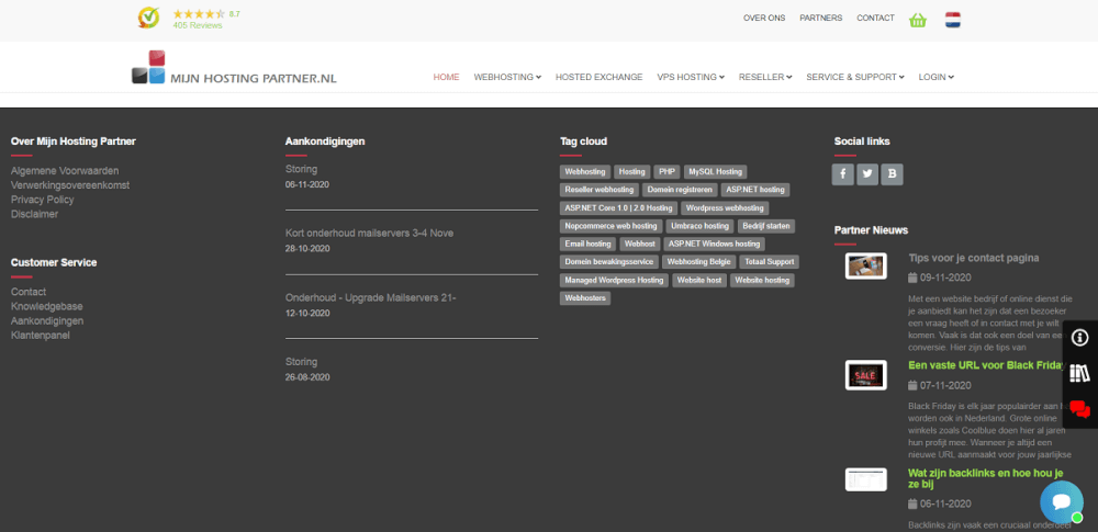
Header of a website
In the header of a website, in addition to a main menu, operations are often performed in the background. Statistics tools and other integrations are put here to see what your visitors are visiting, how long they stay on certain pages and whether they proceed to a sale. In a header, it is very important that visitors can navigate. So visitors who want to contact you can navigate to the Contact page, go to your most popular posts or see your products. They should also be able to do this from the main menu.
In Content Management Systems this is often easy to customize using a theme or template. With a push of a button you can choose the layout you want. Often you can also add HTML to the layout of your choice. An easy link tag to use is the a href tag.
If you build your own website from scratch, you can of course customize it. Often you can use Bootstrap and similar frameworks to choose a predefined layout. With nice buttons and styling.
Your logo should also often be incorporated into the main menu, with a logo it can be quickly recognized which website visitors are on. And is part of the image of your website. The logo should also often be clickable to go back to the home page of your website. So that your visitors can quickly go back to the beginning, or navigate further to your other articles or products.
A header can be "sticky" or fixed at the top of the screen, or you can choose to leave the header or main menu static. It is often advisable to add a button at the bottom right of the page to jump directly to the top. This is usually already included in a theme or template of the website.
Footer of a website
The Footer of a website is actually always the place where a visitor last looks. This may be after they have read an interesting article on the page, or they have a question after viewing a product. The Footer of the website is the place to create the possibility to start a further dialogue with a visitor or to keep him on your website. So think of a short overview of your popular pages or being able to contact you in a quick way.
We also use the Footer to share the latest news through our announcements and latest blog posts. This way we hope to quickly help customers who are looking for the latest information from us. For example a mail server update or a control panel update.
Also, the Footer is the place to put your copyright, this will hopefully prevent your work from being used in other places. And any other information you feel is important to emphasize to your visitors. For example, do you have a mailing list, an eBook or a final product? This could be one of the places you mention it.
Using heatmaps from Microsoft Clarity
To further see if your header and footer are liked by your visitors, you can use the Microsoft Clarity tool. In this tool you have the possibility to use heatmaps to see where visitors hover with their mouse or finger and what they click on. So with a heatmap, you can see exactly where visitors want to see certain information and how they interact with it.
Take a larger margin with the inclusion of heatmaps, so not of 1 day but for example of a whole month. Then you can often see more where the large percentage of your visitors click and interact.
With Microsoft Clarity, it's also possible to see an entire playback of a session. This is a great way to see how visitors navigate within your website. If you see the same thing happening more often in your header or footer you might consider making some changes.
What does your header and footer look like? Share a screenshot on Instagram!