Also check out below articles
 21-11-2025
NET 10 now available at MyHostingPartner!
At MijnHostingPartner.de we are constantly working on making our hosting platforms02-05-2026How old articles continue to deliver results years later
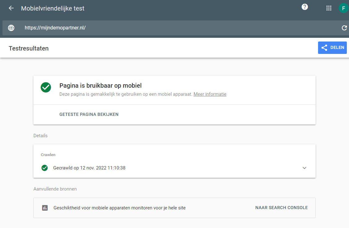
We live in a world of instant gratification. When we post a photo on Instagram12-11-2022Google's mobile-friendly website test
Mobile-friendliness for a website is an important factor in a lot of aspects. With a handy and quick test from Google itself, you can see right away if your website is suitable for this. In this blog post, let's go over what exactly this is, and how you can use it to improve your website.
Take the test now via the following link, and read the article further!
Why mobile-friendliness is important for your website too
Mobile devices are now used more than laptops or desktops, almost the entire western world owns a mobile device what can be described as a smartphone. And this is also spreading rapidly around the world. We are talking numbers in the trillions of users. Your website will not consider all of these trillions of users as your target audience, but it's pretty safe to say that your intended audience is also among smartphone users. If your website is not suitable for this, or you still link to a mobile subdomain. Then you often miss out on a lot of users, and therefore sales.
With most modern methods of creating a website, you don't have to dwell on this as much as before, since almost every Content Management System takes it into account. However, it is still necessary to think about it, and the choice of a theme should make sure that it looks good on all screen sizes. And that your images are compressed etc.
Mobile-friendliness of your website is directly related to how many users can successfully use your website, and therefore also directly related to the turnover. No matter how you earn it on your website. For example, if a webshop does not work properly on mobile, the ads are not displayed or your affiliate links do not work on mobile devices. This will niggle your turnover every time. Therefore, this is an item high on every web designer's list to make as good as possible.
Just does not give the total picture
Just doing the test does not give the full picture, as this only checks some basic things on the specified page. To get more insight, it is advisable to link your website hosting to Google Search Console. If you have not yet done so, you can do this directly in the following way using our knowledge base guide for this:
With Google Search Console you can see in the reports which parts of your website need further optimization. For each part and page you can immediately see what the problem is, and often a link is given to more information on how you can further solve this or improve it. Often it comes down to a few key points, such as making sure your website images and media are optimized for each screen size. Your font remains easy to read on smaller screens. And your website loads quickly on any device.
Find error messages or areas for improvement for your website
Once you have found the errors or points of improvement for your website with regard to mobile devices, you can continue testing. And validate it by requesting a check from Google. You will receive an email to the linked email address from Google Search Console. And a few days later report back whether this is OK or not. You can also test this in a more direct way by using Google Lightspeed in your Google Chrome browser, and then test me right here to see if the pain points have been fixed.
It may be that certain plug-ins, themes, PHP versions and thus large images are often the culprit here. Every website is different in this respect and will need to be checked out to get it as good as possible. However, this is worth the time investment, because every visitor who does not click away from his smartphone browser is another potential customer.
Have you checked the report yet? Which tools and information do you use most often for this work? Let us know via Social Media!